Japanese web design: strange but effective. Why?
-
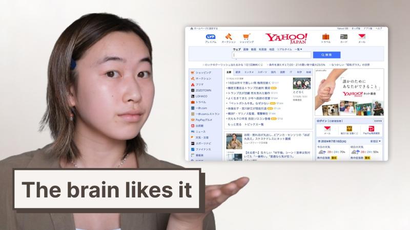
Japanese websites tend to pack a variety of information and elements on one screen. Rather than simply reducing the composition like the American site, even services with the same purpose show much more text and images at the same time. This goes beyond differences in aesthetic tastes and stems from Japanese cultural/psychological characteristics.
-
Japanese users consider it important that there are no 'unexpected and unpleasant surprises' when using the service. This is called 'Anen' and provides sufficient information in advance so that users can clearly predict the results. This is also revealed in Hofstede's Uncertainty Avoidance Index (89 in Japan, 46 in the United States), as Japan extremely dislikes uncertain situations and tries to prevent them through as much information as possible.
-
Japan is a high-context culture, which tends to encourage users to understand the meaning on their own by providing rich information rather than clear instructions or simple messages. In other words, the tendency to communicate through context and suggestion instead of direct expression is also reflected in the digital environment.
-
Just as a restaurant menu provides photos, prices, and ingredient information for all foods at the same time, websites also provide abundant information so that users can accurately understand "what I choose." This reduces uncertainty and increases psychological stability.
-
In the West, convenience is mainly perceived as 'saving one's time,' but in Japan, 'not causing inconvenience to others' is also considered a part of convenience. Providing sufficient information helps users make quick and accurate choices and ultimately minimizes inconvenience to others.
-
In UX, the goal is generally to reduce confusion or friction in the process of achieving goals, but according to an Amazon UX designer, Japanese UX intentionally leaves some friction. This allows users to check more information as they step through the steps and act with greater confidence as a result. Research results showing that East Asian users are quick to adapt to complex information structures also lends support to this approach.
-
Japan has shown strength in hardware-centered innovation, but changes in software and web design are relatively slow. This is because a lot of verification and structuring is needed before introducing a new method due to the uncertainty avoidance tendency. Recently, modern and simple designs are gradually spreading.
-
The Japanese web design case shows that design is not simply an aesthetic taste, but a reflection of cultural and psychological background. This shows that it is important to understand and consider diverse cultural contexts when collaborating with users from other cultures or creating global services.
https://www.youtube.com/watch?v=vi8pyS076a8

Japanese web design: weird, but it works. Here's why
Japanese web design: strange but effective. Why?
-
Japanese websites tend to pack a variety of information and elements on one screen. Rather than simply reducing the composition like the American site, even services with the same purpose show much more text and images at the same time. This goes beyond differences in aesthetic tastes and stems from Japanese cultural/psychological characteristics.
-
Japanese users consider it important that there are no 'unexpected and unpleasant surprises' when using the service. This is called 'Anen' and provides sufficient information in advance so that users can clearly predict the results. This is also revealed in Hofstede's Uncertainty Avoidance Index (89 in Japan, 46 in the United States), as Japan extremely dislikes uncertain situations and tries to prevent them through as much information as possible.
-
Japan is a high-context culture, which tends to encourage users to understand the meaning on their own by providing rich information rather than clear instructions or simple messages. In other words, the tendency to communicate through context and suggestion instead of direct expression is also reflected in the digital environment.
-
Just as a restaurant menu provides photos, prices, and ingredient information for all foods at the same time, websites also provide abundant information so that users can accurately understand "what I choose." This reduces uncertainty and increases psychological stability.
-
In the West, convenience is mainly perceived as 'saving one's time,' but in Japan, 'not causing inconvenience to others' is also considered a part of convenience. Providing sufficient information helps users make quick and accurate choices and ultimately minimizes inconvenience to others.
-
In UX, the goal is generally to reduce confusion or friction in the process of achieving goals, but according to an Amazon UX designer, Japanese UX intentionally leaves some friction. This allows users to check more information as they step through the steps and act with greater confidence as a result. Research results showing that East Asian users are quick to adapt to complex information structures also lends support to this approach.
-
Japan has shown strength in hardware-centered innovation, but changes in software and web design are relatively slow. This is because a lot of verification and structuring is needed before introducing a new method due to the uncertainty avoidance tendency. Recently, modern and simple designs are gradually spreading.
-
The Japanese web design case shows that design is not simply an aesthetic taste, but a reflection of cultural and psychological background. This shows that it is important to understand and consider diverse cultural contexts when collaborating with users from other cultures or creating global services.
https://www.youtube.com/watch?v=vi8pyS076a8
