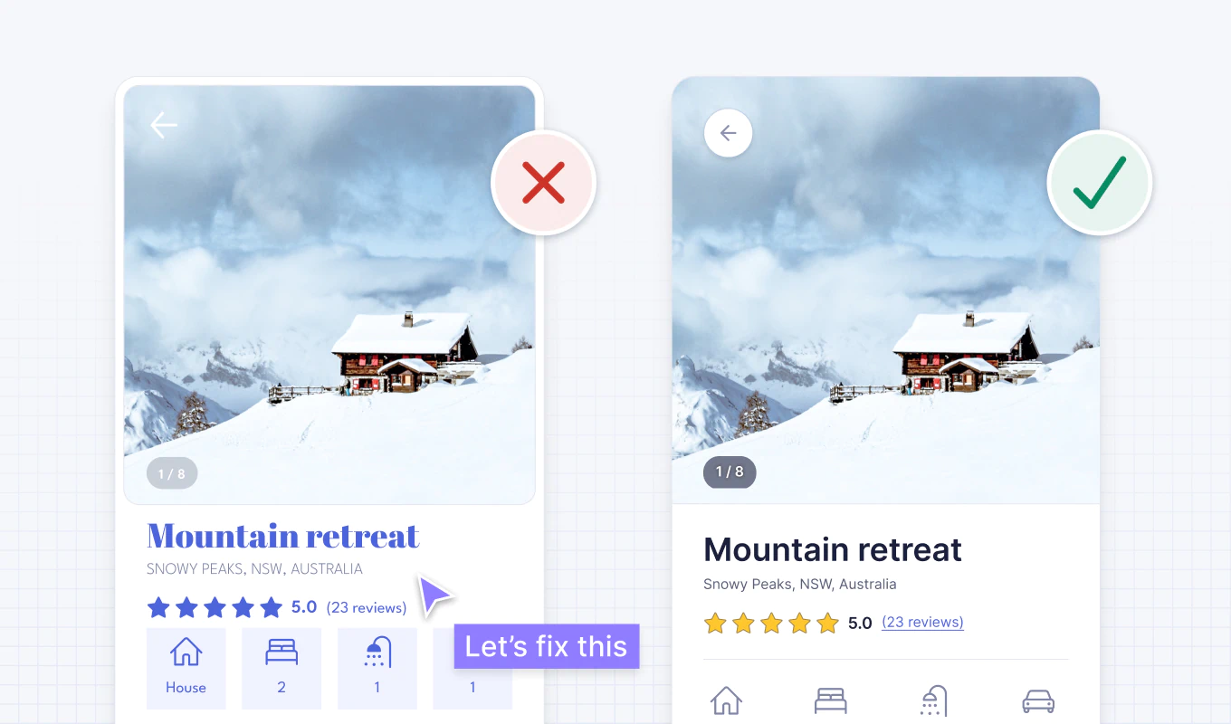
Using the real estate detail page of a short-term accommodation rental app as an example, this article explains the process of improving a complex and difficult-to-use screen using only logical UI design principles. The key is to judge the design based on consistency, visual hierarchy, accessibility, and readability, rather than relying solely on sense or intuition. By applying 16 principles in order, from spatial arrangement to color, contrast, font, alignment, and line spacing, we ultimately create a more intuitive and accessible UI.
1. Logical standards are more important than sense in UI design.
UI design can feel difficult because there are many elements to choose from, such as layout, spacing, fonts, and colors, and usability, accessibility, and psychology must also be considered.
However, after working as a product designer for over 20 years, the author says he has realized that many decisions in good UI design are made by simple and logical guidelines rather than special artistic sense or magical intuition.
"Artistic talent is helpful, but you can mostly learn how to create intuitive, accessible, and beautiful interfaces."
Without these standards, you just move screen elements around and modify them "until they look pretty." Conversely, if you have a logical design system, you can explain why the position, color, size, and style of certain elements need to be changed, and you can make rational decisions faster.
The article emphasizes that doing it yourself is the fastest way to learn, and uses example screens created based on his UI design book and Figma design system to fix problems one by one.

2. Problems and directions for improvement in example screen
The screen used as an example is the accommodation details page of the short-term accommodation rental app. The initial screen is a mixture of information and styles, giving the impression of being cluttered and disorganized. It's difficult for users to quickly figure out what to look at first or what elements to press.
"The original design looks messy, complicated, and difficult to use."
Rather than fixing these issues all at once, the article applies the following 16 principles in turn.
- Group related elements into spaces
- Be consistent
- Make elements that look similar work similarly
- Create a clear visual hierarchy
- Remove unnecessary styles
- Use color for purpose
- Maintain the contrast ratio of interface elements at least 3:1
- Maintain text contrast ratio of 4.5:1 or higher
- Don't convey meaning through color alone
- Use one sans-serif typeface
- Use fonts with taller lowercase letters
- Limit capitalization
- Use only normal and thick thickness
- Avoid pure black text
- Align text left
- Set body line spacing to at least 1.5

3. Organizing information structure with space and consistency
3-1. Group related elements into space
Breaking information into small, related groups helps users understand the screen's structure more quickly and makes it easier for them to remember the content.
Here's how to group related elements:
- Place in the same container
- Place related elements close together
- Make related elements look similar
- Align related elements in one continuous line
Containers are the strongest way to show relationships between elements, but if overused, they can clutter the screen. Therefore, rather than blindly adding borders or boxes, using appropriate margins may be a more concise solution.
In the example screen, there wasn't enough space between the content, so all the information looked stuck together. Adding enough space between elements naturally tied together related content and made the overall screen much more organized.

3-2. Stay consistent
Consistency in UI means that similar elements look similar and behave in similar ways. This should be maintained to some extent not only within the same product, but also compared to other services that users are already familiar with.
Consistent design reduces the need for users to learn new operations each time and increases predictability, helping improve usability and reduce errors.
In the example screens, the styles were different, with some icons filled in and others outlined. Filled icons can be confusing to users because they may appear to indicate a selected state. To solve this, all icons have been unified into a 2pt thick round outline.
I also added a text label to the icon. Not only do labels make it easier to understand what icons mean, but they also help people who can't see the screen when using screen readers.


3-3. Make elements that look similar behave similarly
If elements look similar, users expect them to behave in a similar way. Therefore, elements with the same function should use a consistent visual representation, and elements with different functions should look different.
On the original screen, the container containing the icon looked similar to the blue button "Make a Reservation". Even though the icon container was not actually pressable, it looked like a button and could be misunderstood as an interactive element.
Removing the blue and button styles from icons made it easier for users to distinguish between elements they could actually press and elements that simply displayed information.

4. Clean up visual hierarchy and unnecessary decorations
4-1. Create a clear visual hierarchy
Not all information within an interface is equally important. Important elements should be expressed larger and more clearly, and less important elements should be expressed relatively less so that users can quickly determine the priorities of the information.
This visual hierarchy can be created by making the following differences:
- size
- color
- Contrast
- margin
- Location
- Depth or shadow
When the visual hierarchy is clear, users can find important content just by scanning the screen, and the overall screen looks more orderly and beautiful.


This article introduces the Squint Test as a simple way to check your visual hierarchy. The most important elements should be visible even when you squint, look away from the screen, or blur the design.
In the original example screen, several elements appeared similarly strong, drawing attention to each other. On the other hand, the booking button, which is the key action at the bottom left of the screen, was less visible.

To solve this, we applied a high-contrast background color and bold font to the reservation button. As a result, key actions become the most visible elements on the screen, and the issue of low color contrast in buttons is also addressed.
"Key behavioral elements should generally be the most visible elements of the interface."

When we again applied the squint test to the modified screen, the Book button clearly stood out the most. However, since the body text still seemed too strong compared to its importance, we will further improve it by adjusting the typography.

4-2. Remove unnecessary styles
Unnecessary lines, colors, backgrounds, animations, and decorations distract users and increase cognitive load. Cognitive load refers to the amount of mental effort a user must expend to use an interface.
In the example screen, excessive white space and borders around the image were not needed to convey information or group elements. Removing these decorations simplifies the screen and focuses more on the image and core content.


5. Enhancing meaning and accessibility with color and contrast
5-1. Use color purposefully
Rather than using color indiscriminately for decoration, it is better to use it limitedly only to convey meaning. It is effective to first configure the screen in black and white and then apply color only to the parts that actually convey information.
Brand colors are especially recommended for interactive elements such as links and buttons. Then, as users use your product, they can naturally learn which elements are pressable and which are simply text.
Conversely, using brand colors on non-interactive elements can mislead users into thinking they are clickable elements. In the example screen, the blue title looks attractive, but there was an issue with it looking like a link. Additionally, the color blue was used in the star rating, making it difficult to distinguish between interactive and non-interactive elements.
Removing the blue from the title and star rating focused the color on highlighting the actual interactive elements.


5-2. Maintain a contrast ratio of 3:1 or higher for interface elements
Color contrast is a value that indicates how different two colors appear in terms of brightness. Contrast ratios range from 1:1 to 21:1, where black on a black background is 1:1 and black on a white background is 21:1.
According to the WCAG 2.1 AA standard, UI elements such as icons, buttons, and input fields must have a contrast ratio of at least 3:1. To check this, you can use the WebAIM contrast check tool or Figma plugin.
On the original screen, the arrow icon over the photo had low contrast and was hard to see. Changing the icon color to gray and adding a white background ensured that there was enough contrast no matter what the photo background was. At the same time, the touch area for icons has become larger, making it easier to press on mobile devices.

The main buttons also originally didn't have enough contrast. We previously increased contrast in the process of improving the visual hierarchy, but this was also an important modification in terms of accessibility.

Low contrast can make it difficult for users with low vision to recognize the shape of the button and thus the button itself. Increasing the contrast ratio above 3:1 can simultaneously improve the accessibility and visual priority of your buttons.

5-3. Keep text at a contrast ratio of 4.5:1 or higher
Text requires higher contrast than UI elements. The WCAG 2.1 AA standards are as follows:
- Small Text: Minimum 4.5:1
- Large Text: Minimum 3:1
- Exceeds 18px for bold font
- Exceeds 24px for normal fonts
The text displaying the number of photos in the example screen lacked contrast. We increased the opacity of the gray container and added a text shadow to achieve a contrast of over 4.5:1.

The location text also had low contrast and the font size was too thin, making it more difficult to read. I used a darker gray to increase contrast and then adjusted the font weight.

5-4. Don't convey meaning through color alone
There are several types of color blindness, and difficulty distinguishing between red and green is especially common. Some users may barely perceive color, so color alone should not convey meaning such as link, error, or selection status.
In the original screen, the "Review" text was colored blue to indicate that it was a link. However, when I removed the color it was indistinguishable from plain text. Adding an underline here will help users who can't see colors recognize the link.

6. Create an easy-to-read font system
6-1. Use one sans-serif font
A typeface is a group of fonts that share a similar style, and a font refers to a variation within that font with different thickness or size. For example, a typeface called Helvetica contains fonts such as Helvetica Regular and Helvetica Bold.
In UI design, it's usually safe to use one sans-serif typeface. This is because sans-serif typefaces are usually simple, neutral, and easy to read even at small sizes.
The title in the example screen uses a decorative serif font. This font can be difficult to read and may not match the mood of each property photo. Changing to a simple sans-serif font like the one used in the main text improved usability and visual uniformity.


6-2. Use fonts with larger lowercase letters
To make small-sized text easier to read, it's a good idea to choose a font with tall lowercase letters and appropriate spacing between letters. The height of lowercase letters in a typeface is called x-height.
Fonts with a large x-height are more readable because lowercase letters appear larger even at the same font size. In the example screen, we were using League Spartan, which has a relatively low x-height, but we changed it to Inter, which has a larger x-height.


6-3. Limit capitalization
Excessive use of capital letters makes text feel large and strong and difficult to read.
"Capital letters look like they're screaming and are hard to read."
When people read, they tend to recognize the form of the entire word rather than reading each letter one by one. However, most words written only in uppercase letters appear in a similar rectangular shape, making it difficult to quickly understand the shape of the word and forcing you to read the letters one by one.
The location text in the example screen was in all capital letters. Changing this to sentence case, where only the first word and proper nouns are capitalized, made it much more natural and easier to read.


6-4. Use only normal and thick thickness
Just because a font offers multiple weights doesn't mean you have to use them all. Using too many thicknesses clutters the screen and makes it difficult to apply each thickness consistently.
To create a concise design system, we recommend using only two basic thicknesses: Regular and Bold. If Bold is too heavy, you can use Semi-bold instead.
- Use bold font for titles and parts that require emphasis
- Use normal weight for small body text and secondary text
- Excessively thin or thick thickness is limited to large titles.
The location text in the example was light thick, so it could be difficult to read even after increasing the contrast. Changing this to Regular weight improved readability and simplified the font system.


7. Improve text readability with color, alignment, and line spacing
7-1. Avoid pure black text
Pure black on a white background has very high contrast and can cause eye strain. This is because black has 0% brightness and white has 100% brightness, so the difference between the two colors is too big.
Therefore, it is generally more comfortable to use dark gray for body text rather than pure black. In the example screen as well, the pure black used for several elements has been replaced with a dark gray.
Additionally, rather than displaying all text at the same intensity, we applied different shades of gray depending on importance. Text of relatively low importance, such as accommodation descriptions, is expressed in lighter gray to prevent key information from being buried.

7-2. Align text left
Languages that read left to right, such as English, are usually easiest to read when aligned to the left. Since humans generally scan the screen in an F-shape, it is safe to use left-alignment for long text.
Center alignment can be used for short titles or short sentences, but in longer body text, the starting point of each line will continue to vary. This requires users to move their eyes more to find the start of the next line, which can be particularly taxing for users with cognitive impairments.
In the example screen, the listing description was centered. Changing this to left alignment made it easier to read and aligned with the other text above it.


7-3. Set body line spacing to at least 1.5
Line spacing is the vertical space between each line of text. Having enough space between lines helps users avoid mistakes when re-reading the same line, and makes longer text more readable.
For accessibility and readability, we recommend that longer text use a line spacing of at least 1.5, or 150%. Typically a value between 1.5 and 2 is appropriate.
In the example screen, the text line spacing was too narrow at 1, or 100%. By increasing this to 1.5, the lines were separated from each other, making it easier to read, and giving a more stable visual impression.


8. Final result of applying the 16 principles
By modifying the spatial arrangement, icon consistency, presentation of interactive elements, visual hierarchy, removal of decorations, use of color, contrast ratio, and typography, the initially complex screen was transformed into a much clearer and easier to use screen.
In this example, we could make additional cosmetic adjustments to fit our brand's tone, but the priority was to get basic usability and accessibility right.
"UI design may be a magical art form, but in reality it's often made up of logical guidelines like the ones we just learned."
The author explains that by designing based on objective logic rather than subjective taste, you can create intuitive, accessible, and beautiful interfaces more quickly and easily. Although each principle must be applied consciously at first, with repeated use it becomes a natural part of the design process.
conclusion
The point of this article is not to view UI design as just a realm of vague sense, but use verifiable principles and standards. By grouping information with ample white space, matching the style and functionality of elements, visually highlighting important actions, and adjusting color contrast and fonts for accessibility, even small tweaks can make big improvements.
In the end, a good UI starts with clear structure, predictable interaction, comfortable readability, and accessibility that considers a variety of users rather than flashy decorations.