
An era has arrived where anyone can create polished product UIs without design tools. This article walks through the entire Vibe Design process from start to finish, using a small app (a BugSplat bug tracker) as an example, and explains how to apply it in practice. It covers real-world prompts, core principles, and tips for rapidly improving your product.
1. A New Era of Design: What Is "Vibe Design"?
Design used to be the bottleneck of development. Nothing moved until Figma was ready. But with tools like Lovable, v0.dev, Bolt, and advances in generative AI, anyone can now get started without waiting for a designer.
"You don't need a designer anymore. All you need is taste, sensibility, and a few conversations with an LLM."
One important truth: People don't care about your product itself. They care about getting their own work done well.
2. The Design Compass: Define "Job to Be Done" in One Sentence
The first step in design isn't complicated. Define the user's real "Job" in a single sentence. This sets the direction for the entire design process.
Practical template:
When [situation/trigger] happens, [user type] wants to [action], so that [desired outcome/effect] is achieved.
Let's look at an example:
- Bad: "Developers want to track bugs."
- Good: "When a developer encounters an error, they need to quickly log the bug and assign it, so they can return to their flow."
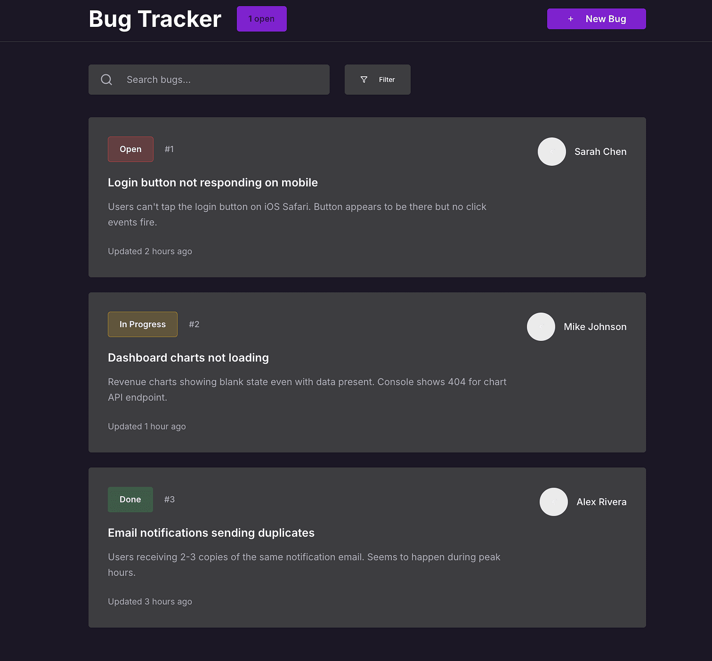
This article uses this definition as the basis for building a small issue tracker called "BugSplat."
3. Stealing "Vibes" from Existing Products: Reference Research
Start by exploring similar products. Try them yourself, take screenshots, and pay attention to:
- First impression: Where does your eye go?
- Flow: How simply can you reach the desired task?
- Mood: Calm? Complex? Playful?
- Micro-interactions: Button effects, error notifications, loading skeletons, etc.
- Speed/Performance: Load times, responsiveness, etc.
The "taste bar" and references you build this way are enormously helpful when communicating requirements to AI.

4. Wireframing: Designing Minimum Features with Practical Prompts
Now it's time for the "wireframing" stage -- establishing the structure. Providing sufficient context along with existing notes and screenshots allows LLM-based tools to produce fast and accurate wireframes.
Wireframe Prompt Example
# Goal
Design a wireframe for a web app. Users should be able to log a bug and assign it to a teammate within 30 seconds.
## Target user
Developer or tester. Needs to log quickly and get back to work.
## Success criteria
- App launch -> Bug input -> Assign teammate -> Save (30 seconds, 3-4 clicks)
## Key screens
- Bug list (sorted by status)
- New bug entry form
- Bug detail view
## Requirements
- Required: title, description, status, assignee
- No account switching/complex onboarding/pre-configuration needed
## Design intent
Fast, minimal, focused feel
## Tech stack
Next.js, Tailwind, Shadcn
## Inspiration from competitors
(Add competitor analysis...)

Iterate by adjusting prompts until you get the structure you want!
5. Implementing Real UI: Design System Organization & LLM Prompt Usage
Now it's time to evolve the wireframe into production-quality UI.
If you already have a design system, feed the relevant component, color, and layout information (e.g., tailwind.config.js, layout/ files) into the LLM. If not, use tools like [Coolors] or [Figma palette generators] to create a core color palette, then add prompts to map these to design tokens.
"Use values from tailwind.config.js instead of inline styles. Reuse existing components."
High-quality prompts = results as close to a real product as possible
6. Final Polish: The 6 Essential UI Principles to Check
If you're at 90% completion, the last 10% is "polishing" -- checking against 6 core design principles!

- Hierarchy: Give appropriate size/position to important information
- Contrast: Do primary buttons and text stand out?
- Balance: Is the layout not skewed to one side?
- Consistency: Do same patterns/components share the same look and feel?
- Alignment: Are elements naturally well-arranged?
- Proximity: Is related information placed close together?
Practical application:
"'Bug Tracker' headline is too large -> reduce it Filter buttons and ticket backgrounds look the same -> separate colors Open ticket count area looks like a button but isn't one -> fix the style"

7. Real-User Testing & Rapid Iteration
The final stage is real user testing. Observing what actual users experience reveals improvement points much faster than internal feedback.
- Feature flags to deploy to a small set of users
- Session replay to identify where users hesitate or struggle
- Analytics tools to check actual goal ("Job") completion rates
- Talk to real users -- directly hear what was slow, difficult, or frustrating
- Rapid iteration -- apply even small fixes immediately for cumulative impact
"Don't try to be perfect all at once. Small repeated improvements are the fastest path to growth."

Conclusion
You think you just need "feel"? Not quite. It's a learnable process -- your own words, powers of observation, well-organized prompts, and a bit of practice. Follow the flow of this article, and you can create beautiful UIs in hours, not days!
Key Takeaways
- Define the "Job to be done" in one sentence
- Actively reference "vibes" from existing products
- Leverage LLM-based tools with sufficient context, iterate and improve
- Always finish with the "6 UI principles" for polishing
- Real user testing & rapid iteration for maximum quality!
Reference Links
- Laws of UX -- Jon Yablonski
- Family Values -- Benji Taylor
- User Interface Design For Programmers -- Joel Spolsky
- The invisible details of interaction design -- Rauno
Share this article with teammates who could use better design vibes!