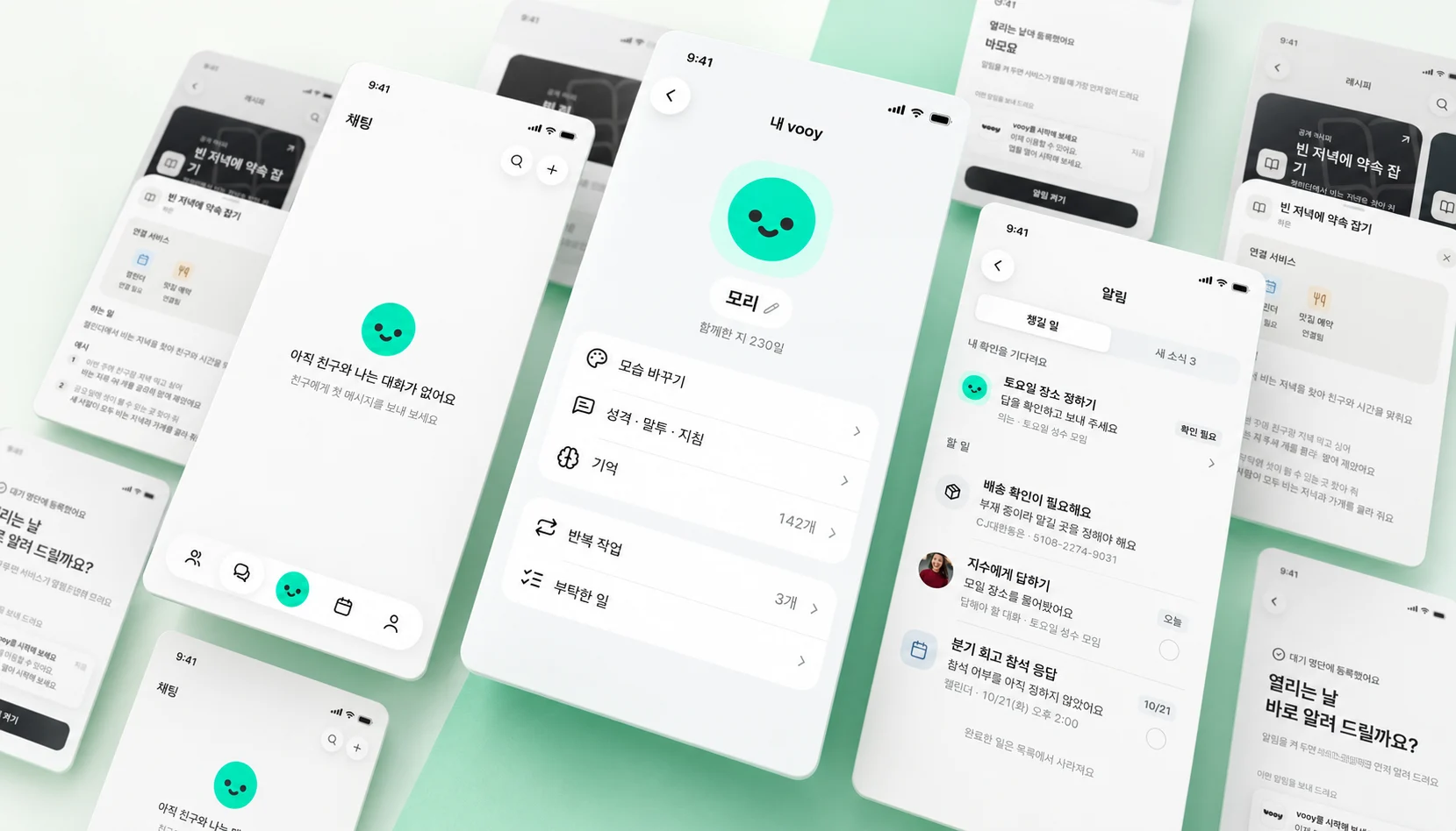
A junior developer and PM at vooy experimented with rapidly improving a messenger app's UI using AI agents on a team that did not yet have a designer. The key was giving the design agent only functional specifications, without showing it the existing code or screens. After a first experiment based on team voting and a second centered on functionality, the team produced 109 screen proposals in a day and implemented roughly 100 in the app.
1. The Problem with an App Growing Without a Designer
The author is a junior developer who began programming only after joining vooy. Its first product designer had not yet joined, so teammates had to build and improve the screens together.
vooy is building a messenger where people and AI agents work together. Users can manage schedules conversationally and delegate everyday work to agents. But few established products offered a clear precedent for this kind of messenger, making it difficult simply to borrow screens from another service.
Developers were already using agents to ship features quickly, but the screen experience was not keeping pace. Buttons worked, yet it was not obvious which one to press first, and the same functionality appeared differently across screens. As the app grew, UI improvements kept getting pushed back.
"The app kept growing, but interface improvements kept getting postponed."
The author was not confident in their own design skills either. Instead of merely discussing what a screen should look like, they decided to generate enough screen concepts for the team to see, compare, and discuss. They would use agents both to produce designs and to build a tool for comparing and voting on them. 🎨
2. First Experiment: Show Screens Before Talking
The first experiment followed a simple principle: "Less talk. More screens."
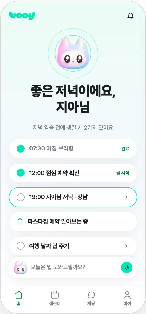
The team created 15 approaches to the same home, chat, and calendar screens. Some emphasized a large character, others packed information densely onto one screen, and others focused on conversational flow. Instead of debating abstract preferences, teammates could point to concrete differences.
The author had agents build the design concepts and voting website, deployed it to Vercel that night, and shared the URL. Teammates reviewed the screens and rated them on a five-point scale.
"What catches your eye?"
One concept, "Soft companion," emphasized the character on the home screen and carried the same emotional tone through chat and calendar.
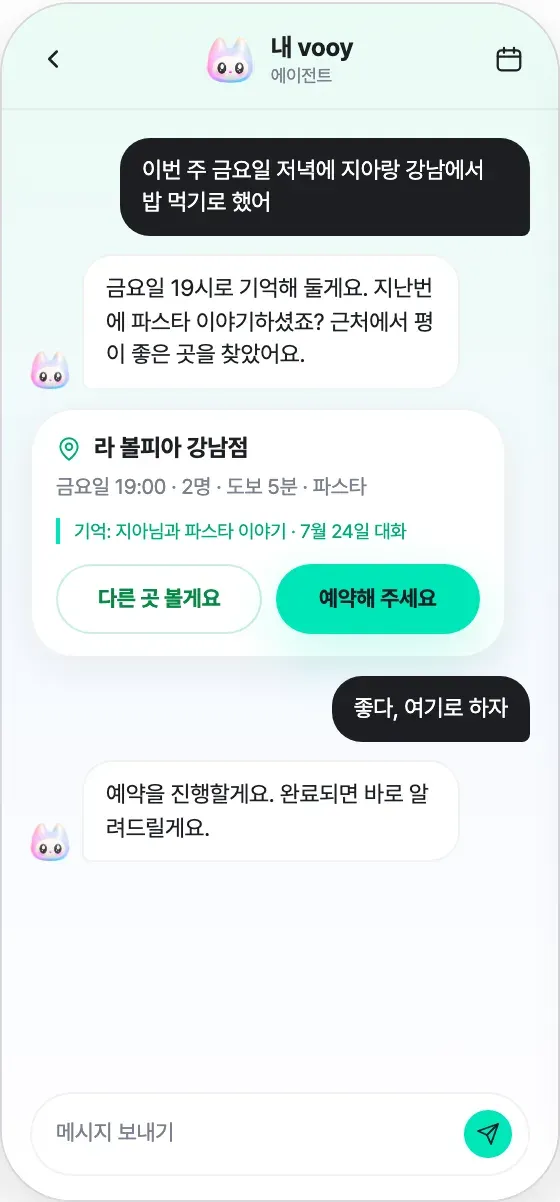
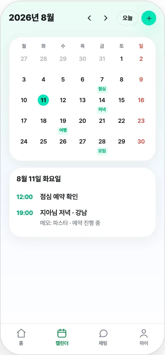
Scores alone did not explain why people liked or disliked something. The author therefore added a feature letting reviewers click a point or drag an area on a screen and place a feedback pin directly there.
Instead of stopping at "I like number 6," someone could say, "I like that the character looks as if it is talking to me, but it doesn't need to appear twice."
Positive feedback made clear what to preserve, while negative feedback showed what to change.
3. Combining On-Screen Feedback into One Direction
Ten people participated in the first experiment and left 124 on-screen comments: 39 positive and 85 negative. The author organized them into 24 groups, then asked an agent to incorporate the design decisions.
For example, the character would remain a prominent part of the home screen without appearing repeatedly in several places.
"Prominent, but not repetitive."
The consolidated concept put one large character at the top of the home screen, with an entry point to conversation directly beneath it.
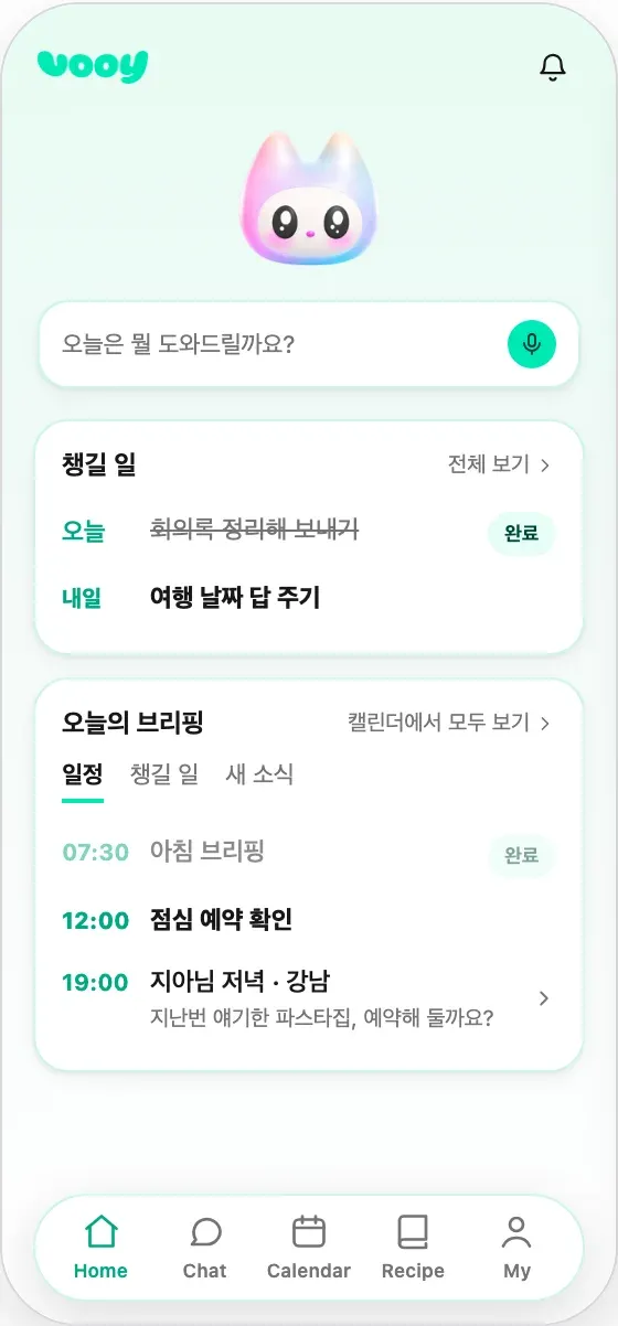
This produced one app draft covering six screens, including home, chat, and calendar. Building the voting tool, collecting feedback, and consolidating it into a design took just one day.
"Once the screens were in front of us, what we wanted to change became clear quickly."
With agents, discussion did not end in decisions alone: those decisions could immediately become the next app version. The experiment demonstrated the potential of creating many screens, having the team evaluate them directly, and connecting concrete feedback to the next design.
4. Second Experiment: Separate the Code-Reading Agent from the Design Agent
The first experiment established a direction, but continued development added screens and accumulated small UI inconsistencies. Similar settings screens had different spacing, buttons had inconsistent visual importance, and explanations that could fit in one sentence were repeated. Individually small, these issues made the app feel incoherent.
When the author tried improving the UI with agents again, they discovered a key problem:
"The moment an agent sees its own codebase, the originality of the UI drops sharply."
An agent reading existing code starts from its components, screen boundaries, and information order. Even when asked to design from scratch, it often only adjusts spacing or colors within the same frame.
This happens because code mixes two kinds of information:
- What the product must do: send messages, retry failed sends, update state, and so on.
- How the current UI expresses those functions: input placement, error presentation, button shapes and positions.
The first must remain, but the second can be redesigned. Giving an agent the whole codebase passes both together, making it difficult to escape the existing UI.
The team therefore separated the roles. One agent researched the app and its code; another designed new screens without seeing the existing ones. Only a functional specification passed between them.
"Pass the functionality, not the screens."
5. Use the Functional Specification as a Contract for New Screens
The research agent extracted user actions, data, states, constraints, and dependencies for each feature from the code and live screens, then assigned feature IDs.
For example, F-EX01 described retrying a failed message. Its specification included the message and conversation IDs needed for a retry, delivery state, and the constraint against duplicate sending.
"Resend the failed message. Update the delivery state based on the retry result."
The design agent did not receive:
- Existing colors
- Layouts
- Component names
- Button positions
- Existing screen structure
- Code paths implementing features
Mappings from feature IDs to original code were kept in a separate file, features-sources.md, withheld from the design agent. Even paths and filenames could provide clues leading back to the old UI.
"Keep the source map separate."
The features.md file became an input contract. The design agent knew a message-retry feature was required, but not where its button had been. It could therefore decide afresh which screen should expose it and how.
The new starting point was functionality and external references, not the implementation. The design agent received minimal brand materials, such as the service name and mascot, then used Mobbin MCP to study conversation lists, calendar information density, and empty-state guidance. Instead of forcing functionality into existing components, it combined patterns appropriate to the required behavior.
After designing the new screens, the team mapped the feature IDs back onto them—for example, identifying where F-EX01 appeared as retry functionality in the new conversation screen.
"The presentation can change, but the ID keeps the required behavior traceable."
After checking for missing features and selecting a direction, an implementation agent applied the new designs to the existing codebase. The author called this "UI Big Bang." Starting with functionality and external references rather than existing implementation gave the agent room to redesign the app. 💥
6. Creating 109 Screens in a Day and Applying Them to the App
The second experiment began in the evening and produced 109 reviewable screen proposals within 24 hours. The team compared them together and refined the direction to fit the app's user flows and visual tone.
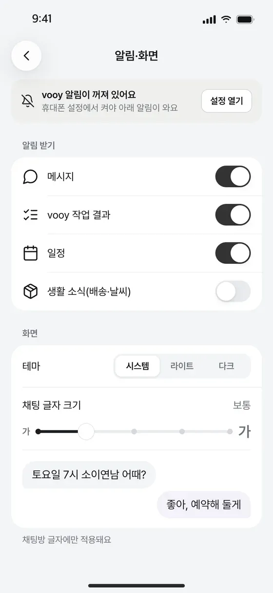
For example, notification and display settings were brought together, with theme and text-size controls discoverable in the same context. The aim was to align information hierarchy, visual language, and navigation across the app so moving between screens felt like using one product.
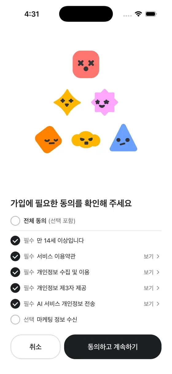
For the author, the important change was replacing a vague request to "make it prettier" with a way to compare screens and choose using clear criteria:
- What is read first?
- Can users easily understand the next action?
- Do similar features look consistent?
"Choosing a design became a way to define the next development task."
The workflow was:
- Compare screens side by side and choose a better direction.
- Give the selected screen itself to the agent as the brief for the next development task.
- Have the agent implement it in the existing app, while the team repeats running, reviewing, and refining.
The team applied roughly 100 of these screens to the app the very next day.
"With agents, of course."
7. Improving the Product Matters More Than the Job Title
The author's actual role is product manager, not developer or designer. They learned coding only after joining vooy and say they still learn daily while opening dozens of PRs a day.
The important shift was not the title but how they worked. Previously, they passed along requests and waited for results. Now, they could turn ideas into screens themselves, gather feedback, and participate all the way through implementation.
This made judgment about what is good feel as important as technical capability. They continually consider what users should see first, how the next action can feel natural, and which principles should hold across the product.
"What should people see first? How can the next action feel natural? What principles should hold the whole app together?"
vooy's screens still change every day. Work that might seem outside someone's role elsewhere is open to anyone at vooy if it can improve the product.
"We find what needs doing and try it, regardless of where our titles sit."
The article closes by announcing that vooy will soon be available on the App Store and Google Play. It is also seeking a product designer to continue these experiments—someone who can use agents and ample tokens to implement design principles directly in the product.
Closing Thoughts
The central idea is not merely using AI agents to generate screens quickly. It is deliberately separating functionality from design information to escape existing-code constraints, then turning many concepts into real development work through team feedback and selection.
Ultimately, UI Big Bang is less about letting an agent design on its own than about creating an environment where people can compare and decide better, then implementing those decisions quickly.