This summary distills a video that studied 1,460 onboarding flows across 986 apps and websites. Its main argument is simple: the best onboarding is not necessarily the shortest onboarding. What matters is how quickly the product gets a user to an aha moment, the point where the product's value becomes real.
1. Question the idea that onboarding must be short
The video starts by challenging the common advice that onboarding should always be brief. In the dataset, the average app onboarding flow had 25 screens, and categories such as finance, music, health, fitness, and education tended to be longer. Seven of the ten longest flows were finance apps.
That does not mean long onboarding is automatically bad. Some very successful products have long flows, while some short flows are common in AI products. The better question is not "how short is it?" but "how quickly does it move the user toward value?"
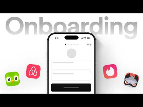
2. The basic shape: sign up, set up, aha moment
The recurring pattern is sign up, set up, and then an aha moment. The aha moment differs by product: Airbnb might be the first booking, Netflix the first piece of content watched, and Mobbin the first useful screen saved to a collection.
Good onboarding is therefore not a feature tour. It is a designed path toward experiencing value.
3. Sell outcomes, not features
Strong onboarding screens do not simply list what a product can do. They show the outcome the user can expect.
Examples include products that show the app working immediately, use animation to make the product legible without much reading, or even let users try the core experience before creating an account. The video highlights that this is still rare in AI products, where many products ask users to sign up before they can feel the value.
Even small copy changes can turn a boring signup screen into a pitch. A line of sharper copy or a row of recognizable logos can make the value feel clearer.
4. Human touches build trust
Some products win trust not with a hard pitch but with signs of intention. Founder notes, handwritten details, contextual birthday messages, CEO videos at the moment of success, or a personal note after account creation can make the product feel more human.
The lesson is that users often trust the intent behind a product before they trust its feature list.
5. Personalization is rare, so it can be powerful
Only 23% of the onboarding flows in the study used personalization, and AI apps did so even less often. The video suggests that many AI tools prefer to learn from usage rather than asking too many questions upfront.
When personalization is used, it has to pay off immediately. Asking two questions and then producing a visibly tailored recommendation can work better than a long quiz. Headspace improved trial conversion by letting people select multiple goals instead of forcing them to pick only one. Dollar Shave Club improved subscription conversion by making quiz copy more conversational.
The point is that personalization is not the question itself. It is what opens up after the question.
6. Prove that the product is tuned to the user
The strongest personalized flows immediately show what the user's answers produced: a plan, a predicted milestone, a customized home screen, or a clear promise such as being able to communicate on a trip after two months of language practice.
This creates confidence before the user has fully used the product. The product is already behaving as if it knows what the user came for.
7. Paywalls work better when they follow value
About 22% of the studied apps showed a paywall during onboarding. The better examples combine personalization, proof, and timing so that the paywall feels like part of the story rather than an interruption.
Some products use one-time offers after a quiz, show social proof before payment, or make the payment moment itself feel designed. Grammarly reportedly increased plan upgrades by recommending a plan based on quiz answers.
The useful question is not whether a paywall exists, but whether the user has already felt enough value to understand why it appears.
8. Long flows can feel short when progress feels good
The video uses Duolingo as an example of a long onboarding flow that does not feel long. It lets users choose a language, learn something about themselves, complete a first lesson, and feel a small win before account creation.
Other products reduce perceived friction with animation, playful loading states, satisfying progress markers, or a memorable character. The principle is to mix progress and delight so that a long path still feels like movement.
9. Help in context instead of teaching everything upfront
Good onboarding does not dump all instructions at the beginning. It gives help exactly where the user needs it.
Examples include contextual tooltips, reassuring microcopy, live password requirement checks, and lightweight nudges in empty states. Mural reportedly improved week-one retention by replacing popups and banners with a clear six-step checklist that remained useful after onboarding ended.
10. Explain permission requests and move friction carefully
Permission prompts work better when users first understand why the permission matters. A custom explanation screen before a notification prompt can improve acceptance because the user sees the benefit first.
The video also points out that friction is not always removed; sometimes it is relocated. Splitting a signup form across multiple screens can reduce the feeling of burden, even though the total information requested is similar.
The best design also depends on audience and culture. A dense interface may feel cluttered to one audience and efficient to another.
11. What matters, and whether onboarding is always needed
There is no single best-in-class onboarding formula. The memorable flows often do not feel like onboarding at all. They simply move the user to value quickly.
For some products, personalization and delight are useful. For others, especially products whose core interaction is obvious, the best onboarding may be almost no onboarding at all. AI chat products and search or discovery tools can sometimes deliver value through the first prompt or first query.
Closing
The central lesson is not to make onboarding short. It is to design the path to value. Show outcomes, build trust, make personalization pay off, time friction carefully, and remember that sometimes the best onboarding is letting the product speak for itself.