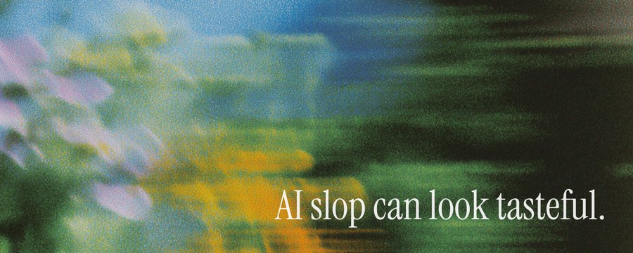
AI brands have repeatedly used serif typefaces, nature photography, cream backgrounds, muted colors, and philosophical copy to make technology feel more human and approachable. As the same expressions have spread, however, the style has stopped differentiating brands and instead become a familiar signal that says, "This is an AI-made brand." The important issue is not nature or serif type itself, but how specifically each visual choice explains the way a particular product works and what it is.
1. Nature and Serif Type Took Over AI Branding
In a remarkably short time, the visual language of the AI industry converged. Serif type, cream and beige backgrounds, landscape photography, plants and paper textures, pastel colors, and philosophical statements about intelligence, humanity, possibility, and the future became a default formula for AI brands.
The style originally aimed to convey "thoughtful, human technology." Anthropic expressed this language especially clearly through editorial typography, warm neutrals, and an atmosphere reminiscent of a serious independent publication.

OpenAI also used nature photography in its earlier brand work, attempting to translate largely invisible computational processes into a more concrete, sensory rhythm.

Over time, however, more and more AI products began to look as if they were all emerging in the same way from a quiet field at sunset. Each brand may look refined and complete in isolation, but placed side by side, they feel like one brand wearing different logos.
"AI branding became 'Anthropic' in two senses: it tried to look more human, and it tried to look like Anthropic."
2. Why Nature and Serif Type Became the Face of AI
There were clear reasons for this aesthetic. AI is abstract, unfamiliar, and sometimes unsettling. Its operation is difficult to see, and its reach is difficult to explain. Nature offered a useful way to communicate that abstraction because it speaks a language people already understand.
Concepts such as growth, flow, branching, emergence, memory, and adaptation can be expressed through organic forms without a technical explanation.

Serif type served a similar role. Through its associations with literature, scholarship, journalism, and publishing, it borrows a sense of authority and thoughtfulness. A serif can make a company appear to be considering not only the technology it builds, but also the philosophical consequences of building it.
Muted colors suggest restraint and stability, while landscapes and plant photography with tactile textures make a brand feel as if it has a soul.
"Serif type borrows authority from literature and scholarship, journalism and publishing. It makes the company look as though it has considered the philosophical consequences of what it is building."
Perplexity's ads for the Comet browser and the Manus wordmark sit within the same trend.


Ultimately, all these choices tried to answer a practical question: How do you give a human face to synthetic technology that is difficult to understand?
3. From Cold Technology to Quiet Intelligence
For a while, the strategy worked. Before it, advanced technology was commonly represented by chrome robots, blue gradients, glowing brains, neon grids, and black interfaces. Compared with those images, AI branding built from nature and serif type felt quieter and more considered.
The new visual language suggested that intelligence did not have to feel aggressive or mechanical. It could be quiet, contemplative, and close to human life.


But category signals lose their meaning through repetition. When every brand emphasizes its humanity in the same way, people begin to recognize the human expression itself as a formula.
"The visual language was created to reassure us, but now the way it reassures us looks like a convention in itself."
The result is a paradox. The more AI borrows nature in order not to look like AI, the more a natural landscape begins to look like a marker of AI.
"The human mask became one of the machine's most visible signals."
4. Beautiful but Interchangeable Design
The writer argues that AI slop does not have to be ugly or crude. Beautifully typeset, carefully art-directed work made by talented visual professionals can still feel like AI slop.
The composition can be balanced, the photography excellent, the animation delicate, and the writing thoughtful. It can still feel like slop because the design communicates almost nothing about a particular product or a distinctive intention.
The writer calls this low-specificity design. It is polished but interchangeable: swap the logo or a few words, and the same identity could belong to twenty other companies.
"A design can be refined and still interchangeable. Replace the wordmark and swap one mountain photograph for another, and the same identity could belong to twenty companies."
The problem is an atmosphere without a point of view. When an aesthetic becomes detached from its reason for existing, it becomes a template. Serif type and field photography are not inherently bad. The problem begins when none of those choices can explain why this particular product should look this particular way.
"The problem is not serif type or a photograph of a field. The problem is when none of it tells us why this system should look like this."
Such design conveys the product's category more strongly than the product's actual nature. It tells us, "This is an AI brand," but not, "This is precisely what this AI is, and this is how it works."

AI-generated images show a similar problem. The lighting may be cinematic, the colors appealing, and the forms suggestive of something meaningful taking place, yet it can be difficult to explain why those particular lights, colors, and shapes were chosen.
"AI-generated images often contain traces of intention without a strong chain of choices underneath them."
5. When Nature Explains How the Product Works
Not all nature-based branding is empty. In some of OpenAI's earlier approaches, transformations in nature were connected to specific product characteristics.
- A flower blooming represented generation.
- Flowing water expressed continuity and movement.
- A changing landscape showed an invisible computational process unfolding over time.

Here, nature was not merely decoration that softened technology. It helped explain how the product behaved and the process it followed over time.
When nature becomes only a general symbol for "human intelligence," however, the relationship between product and image weakens. The brand stops beginning with the way a particular system operates. Instead, it first dresses the technology in humanizing motifs such as nature, paper, and plants, then packages the result.
A more persuasive visual identity should begin with the product's actual conditions:
- Is it a tool the user intentionally opens and operates?
- Is it a process that remains active somewhere else?
- Is it a system that returns later, leaving traces of its work?
- Is it more like an instrument, an archive, or an environment?
- Is it a new form that cannot yet be classified reliably?
- What does it remember, and what traces does it leave?
These are product-planning questions, but they are also raw material for branding. The product's materiality, movement, typography, language, and atmosphere can emerge naturally from what the product is and how it works.
"The brand should be part of the world the product inhabits, not a humanizing costume applied on top of it afterward."
The writer describes this as using ontology in branding. By understanding what a product contains, how its components relate, and how it changes over time, a visual system can respond to the product's essence.
6. Must Artificial Intelligence Look Human or Natural?
The writer poses a more fundamental question: Why are we so uncomfortable when artificial intelligence looks artificial?
Much of today's AI branding assumes that artificiality looks cold, hostile, and unsophisticated. Before the machine appears in public, it is therefore dressed in paper textures, plants, landscapes, handwriting, and literary language.
The motivation is understandable. Most of our established images of AI come from science fiction or corporate technology: chrome humanoids, black terminals, blue circuitry, and glowing brains. They can easily make AI look dystopian and threatening.

Yet dressing a machine like a quiet meadow creates a different kind of distance. If a product acts like a computational process or an agent while presenting itself like an independent literary journal or a tranquil countryside, people sense the mismatch.
"The brand promises one kind of presence, while the product produces another."
The alternative is not a return to chrome robots and neon grids. Artificiality itself is not the problem. The problem is that we have not yet developed a rich enough language for artificial beings that are neither dystopian nor disguised as organic ones.
A contemporary artificial presence might:
- Be precise without feeling cold or sterile.
- Fit naturally into everyday environments without pretending to be human.
- Feel procedural, unfamiliar, quiet, or warm.
- Reveal machine time, repetition, persistence, electric light, modularity, and nonhuman rhythms.
"A machine can be warm without pretending to be organic."
7. Questions Good AI Branding Should Ask
Nature is not the problem, and neither is serif type. Artificial materials are not always more honest, either. Any visual element can become another costume if it has no meaningful relationship with the product.
The essential question is what each visual choice tells us.
- Does this choice communicate how the system works?
- Does it show what kind of attention the product asks of the user?
- Does it express what the system remembers and what it leaves behind?
- Does it reveal how the product enters the user's life?
- Does it help users understand what kind of entity they are being asked to trust?
A visual identity cannot explain an entire technical system. It can, however, show how specifically the company has imagined the relationship among that system, the world, and its users.
The question, then, is not "Should an AI brand use trees?", "Should it use a serif?", or "What color should it choose?"
"Can those choices reveal this particular product and the world it wants to create?"
Conclusion
The problem with AI branding is not nature, serif type, or warm colors. It is the way these elements are repeated as a formula for human sophistication without any connection to how the product works or what makes it distinctive.
Instead of wearing a human mask, the next generation of AI brands must find a presence that is artificial yet compatible with human life. The goal is not merely attractive design, but specificity and distinctiveness: a design that lets people sense what the product remembers, how it behaves, and what kind of relationship it forms with the user.