This summary argues that App Store screenshots are not merely a design task, but a powerful marketing tool for earning user empathy and driving downloads. It explains why the common developer habit of writing feature-centered screenshot captions fails, and proposes a copywriting strategy focused on user problems, outcomes, and transformation. Drawing on Theodora's proven advice, it offers concrete ways to rewrite screenshot text, with examples, as a practical guide to increasing app downloads.
1. The Misunderstanding About Screenshots and Downloads
App developers often treat App Store screenshots as a design detail: choose five good screens, add overlay text that explains the features, and call it done. Paul Solt admits that he used to handle screenshots exactly this way, but the result was stagnant downloads. He eventually realized that this mistaken approach to screenshots was hurting the app's success.

2. The Real Secret Theodora Taught About Screenshots
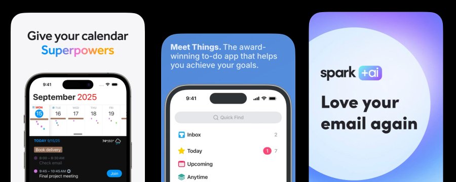
Through an expert named Theodora, also known as DesignerAnts, Paul learned a crucial lesson: 70% of screenshots are copywriting. In other words, the most important part of a screenshot is not beautiful UI, but text that moves the user's mind. In one case, an app saw downloads jump by 80% after only the screenshot copy changed. The design stayed the same; only the words changed. This is one of the biggest mistakes most developers overlook, and it can have a decisive impact on app success.
blockquote Before -> After 70% of an App Store's screenshots are copywriting. "Pong" may NOT be known by Gen Z. You have an opportunity to communicate the main reasons why anyone should download this game! I dug into it a bit, and I found some Gen Z are looking for arcade games, so you
70% of App Store screenshots are copywriting. "Pong" may not be familiar to Gen Z. You have a chance to communicate the main reasons anyone should download this game. I looked into it a bit and found that some Gen Z users are looking for arcade games.
3. Focus on User Value Instead of Feature Descriptions
Because developers know their apps inside out, they naturally write screenshot text around what the app does, such as "Dark Mode Support," "iCloud Sync," or "Custom Widgets." Paul Solt points out that this kind of description is not useful to users. A person browsing the App Store is not asking, "What does this app do?" They are asking, "Do I need this app?" Screenshots that read like lists of features feel like patch notes and fail to catch a potential customer's attention.
blockquote Your screenshots read like patch notes to someone who hasn't bought in yet.
Your screenshots read like patch notes to someone who has not yet decided to care.
A shift in thinking is needed. Instead of explaining what the app does, show what changes in the user's life.
- Bad: "Custom Dashboard" -> Good: "See everything that matters at a glance."
- Bad: "Workout Tracking" -> Good: "Never forget what you lifted again."
The important thing is to make a specific promise. "Productivity app" is abstract, but "Never lose meeting notes again" gives someone a clear reason to download. The more precisely you explain how life improves after using the app, the more vividly users can imagine themselves using it.
4. Screenshots Should Be Storytelling
Paul Solt emphasizes that screenshots should form a story that communicates meaning in sequence. If the screenshots make sense in any order, then they are not a story; they are only a catalog. Theodora recommends this sequence:
- Screenshot 1 - Present the problem: Clearly show the pain or frustration the user experiences before using the app. "Tired of being buried in notes you can't find?"
- Screenshot 2 - Present the transformation: Show the positive change that happens after using the app. "Everything you capture is organized automatically."
- Screenshot 3 - Present proof: Offer credible evidence such as numbers, testimonials, or concrete results. "Used by 10,000 developers every day."
- Screenshots 4-5 - Communicate features: Show one or two key features that make the promised transformation possible.
Each screenshot should have one message and one job. If something needs two sentences to explain, it is often better to split it into two screens.
blockquote Your UI is evidence. Your text is the argument.
Your UI is evidence. Your text is the argument.
Before designing the screen, first write the headline for each screenshot. If you cannot describe the transformation in eight words or fewer, you do not yet understand it clearly enough. Once the headline makes the message precise, place UI that visually supports that message. In screenshots, text is the most important part; the UI is supporting evidence.
5. An Example from Paul's App, Super Easy Slides
Paul Solt compares the early screenshot copy for his app Super Easy Slides with improved copy to show how these principles work in practice. The original version used feature-centered copy:
- Notes -> Slides. Instantly.
- Full Screen Always Readable.
- Slides Over Any App.
- Auto-Numbering that Works.
This copy clearly explained what the app did and highlighted major features, but it did not sell the product. It did not give users a problem to recognize or a reason to feel motivated. It sounded like a feature list. Paul realized that he had focused on what the app does, not why someone needs it.
As Theodora advises, if each screenshot is to work like an ad, it should first present a problem or desire, then show the outcome, and only then use features as support.
Here is the improved screenshot copy for Super Easy Slides:
- Before: Notes -> Slides. Instantly.
- After: Stop Designing Slides Write notes. Start presenting.


-
Before: Full Screen Always Readable
-
After: Stay Focused While You Present Clean slides. No distractions.
-
Before: Slides Over Any App
-
After: Stay In Your Flow Present without breaking your momentum.
-
Before: Auto-Numbering that Works
-
After: Never Fix Slides Manually Again Your structure stays clean automatically.
The new version leads with the outcome, not the implementation. Even non-developers can immediately understand it. It connects to real user problems such as time, focus, and clarity, while features support the message rather than becoming the headline.
6. Improve Your Screenshots Right Now
Paul Solt says developers can improve screenshots even without help from a designer. One simple test is to cover the UI with your hand and read only the text out loud. If it sounds like a feature list, rewrite it around user value. Publish the revised screenshots for 30 days and watch the conversion rate. He believes one rewrite session will teach you more than months of keyword optimization. He also recommends downloading Theodora's free App Store Screenshot Optimization Playbook PDF and giving it to AI tools such as Claude or Codex to improve an App Store listing today.
Closing Thoughts
App Store screenshots do more than show what an app looks like. They are one of the most important marketing tools for persuading potential users of the value the app will give them. Instead of listing features, screenshot copy should empathize with the user's problem and tell a concrete story about the positive change the app creates. Check your screenshot text now and rewrite it from the user's perspective. A small change in wording can lead to a surprisingly large increase in downloads.